01
The first screen
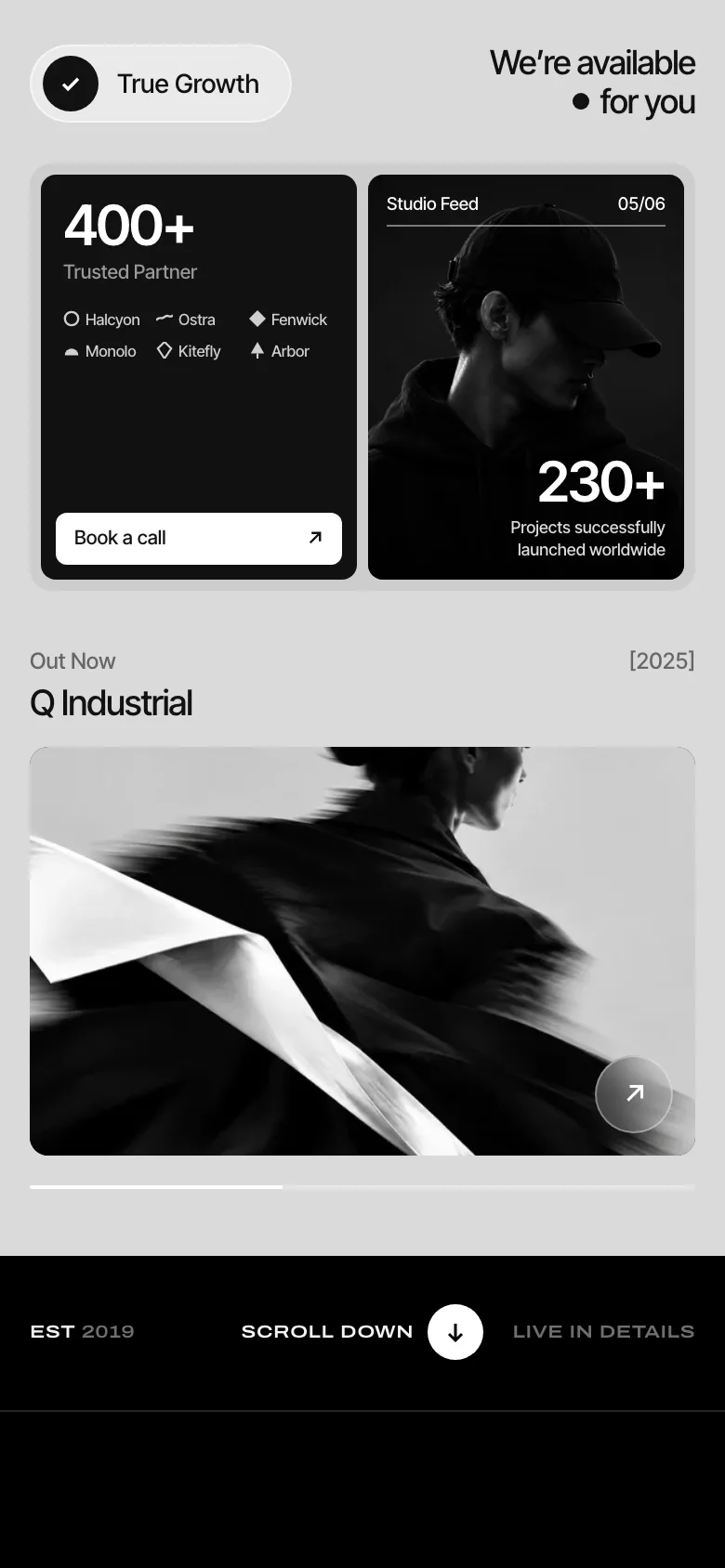
A studio portrait seen from behind, with the Lunar plate set in glass across his back. The title rises out of its mask, the photo sharpens into place and the numbers count up.
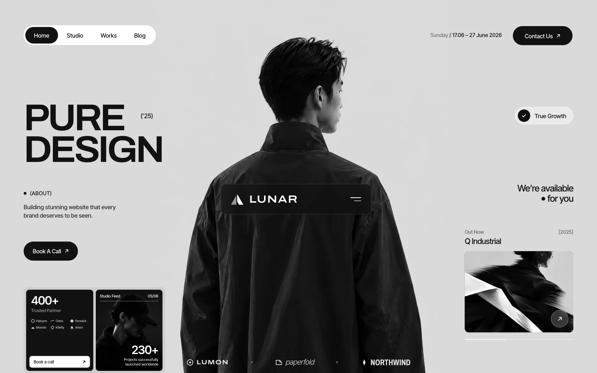
A monochrome, editorial landing page for a branding studio: a studio portrait, a manifesto that fills in as you read, and the studio’s proof in one panel.
Visit the website (opens in a new tab)
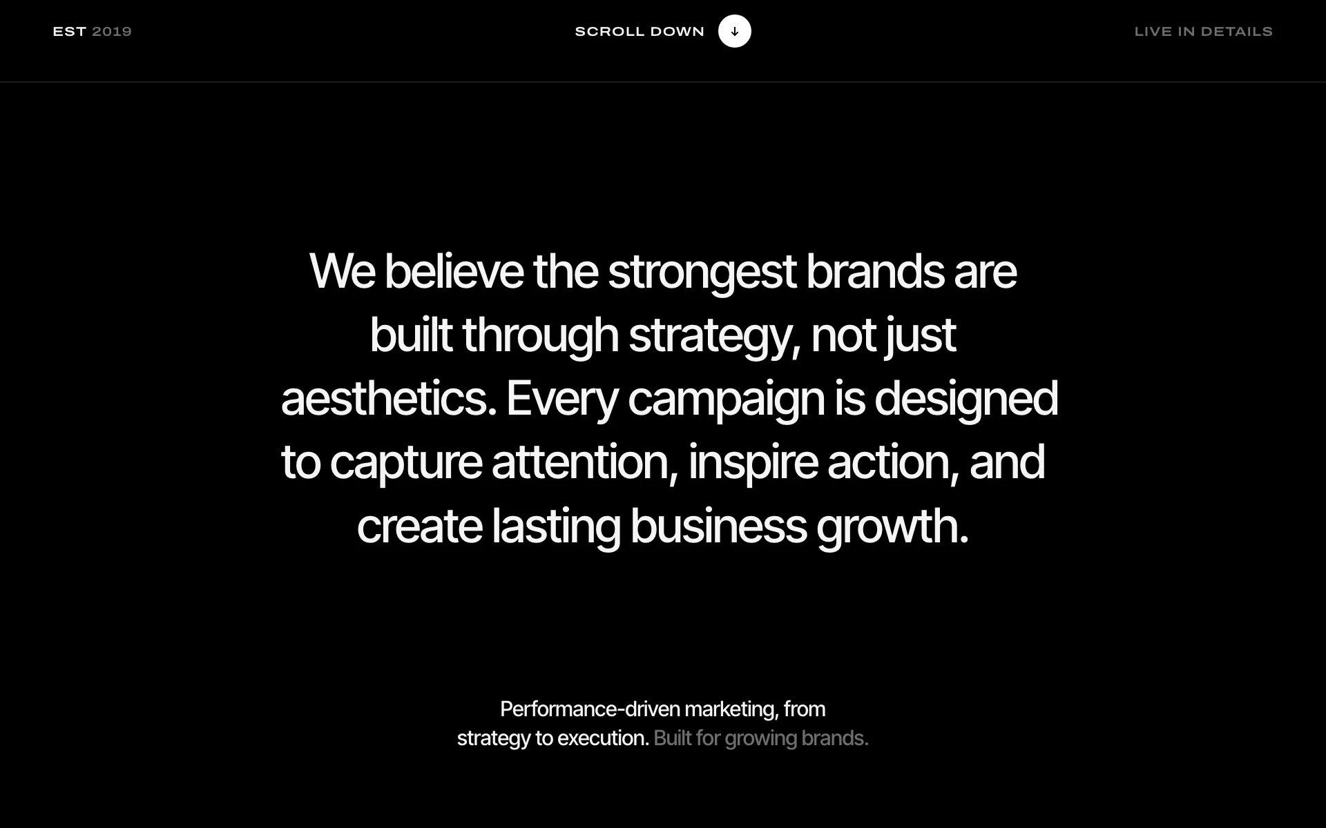
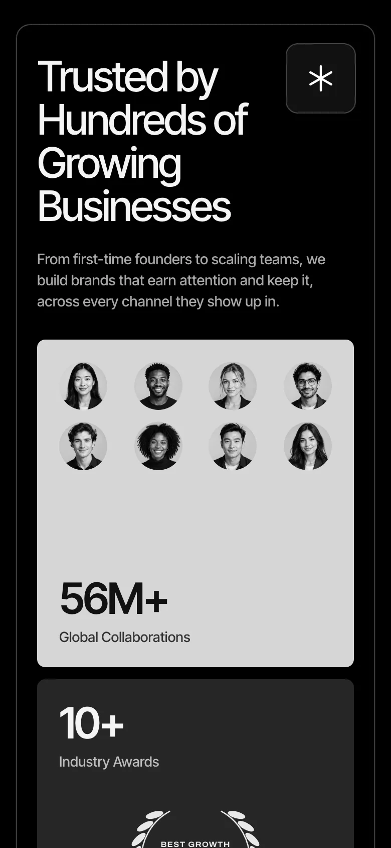
Lunar is a branding studio. We designed and built its landing page as one page in three parts: a light-grey hero with a large black-and-white portrait, a black manifesto whose words fill from grey to white as you scroll, and a bordered panel of the studio’s proof.
A studio portrait seen from behind, with the Lunar plate set in glass across his back. The title rises out of its mask, the photo sharpens into place and the numbers count up.
Five lines on black. Each word fills from grey to white in reading order as the section scrolls past.
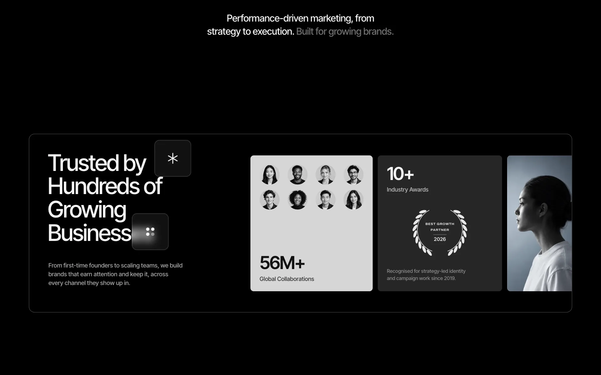
Collaborators, awards and a portrait, with the counters and avatars animating in when the panel appears.
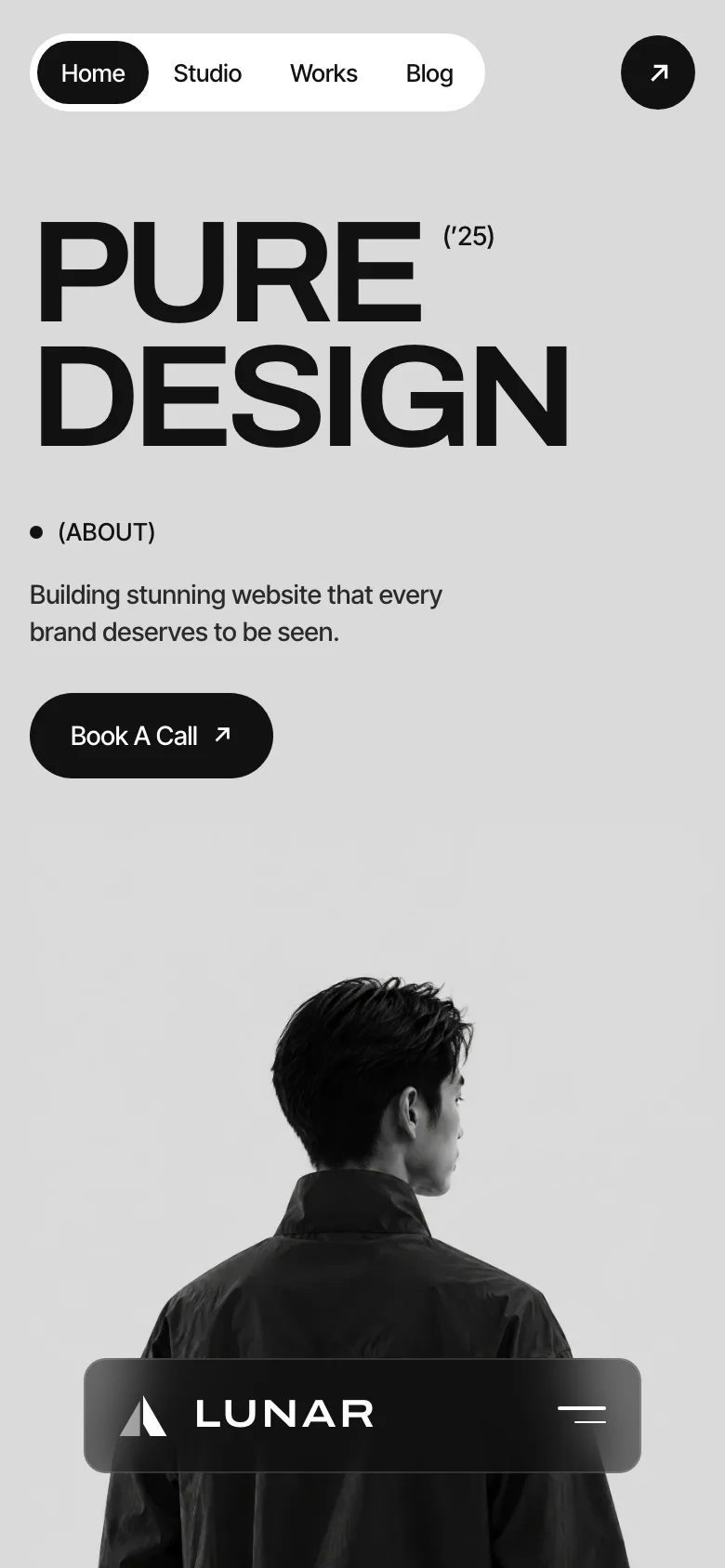
One column on a phone: the title first, then the portrait with the plate over it, then the stats.
Start with a free audit, then see exactly what we’d build and in what order.
Free audit firstNo obligationPlain-English results