Freshness nobody can see
Roast date is the roaster’s biggest advantage, and most stores bury it on the bag.
Brand and online store for a small-batch roaster, built to turn one-off orders into subscribers who never run out.
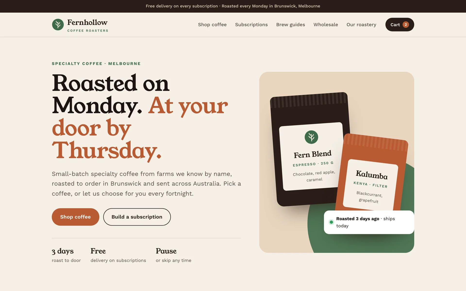
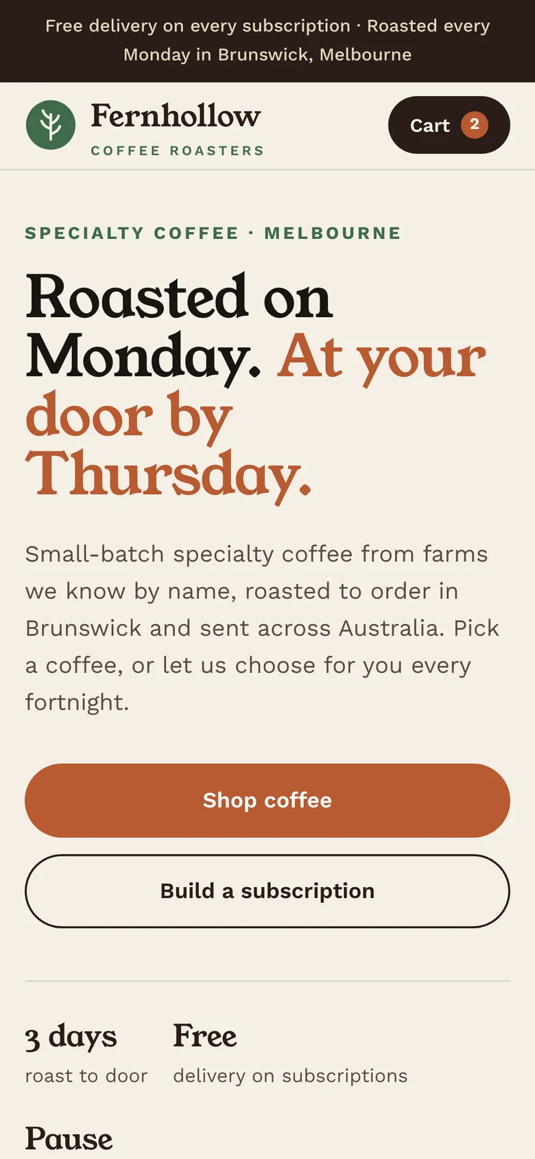
Fernhollow is a brand and online store for a small-batch coffee roaster in Brunswick, Melbourne. We built it to show how we help a direct-to-consumer brand turn a first order into a subscription, without discounting its way there.
Small roasters sell a better product than the supermarket and charge for it, but online they compete with marketplaces and big brands that outspend them. A first order is expensive to win, so the business lives or dies on whether the customer comes back.
Roast date is the roaster’s biggest advantage, and most stores bury it on the bag.
Repeat orders pay the bills, yet subscribing is often a separate app with its own checkout.
Without a reason to come back, a happy first customer orders from someone else next time.
Foundation first, in this order, so each step makes the next one work harder.
Freshness as the promise: roasted on Monday, at the door by Thursday, said on every page.
A fern mark and a warm, bookish serif that feels like a neighbourhood roastery, not a commodity.
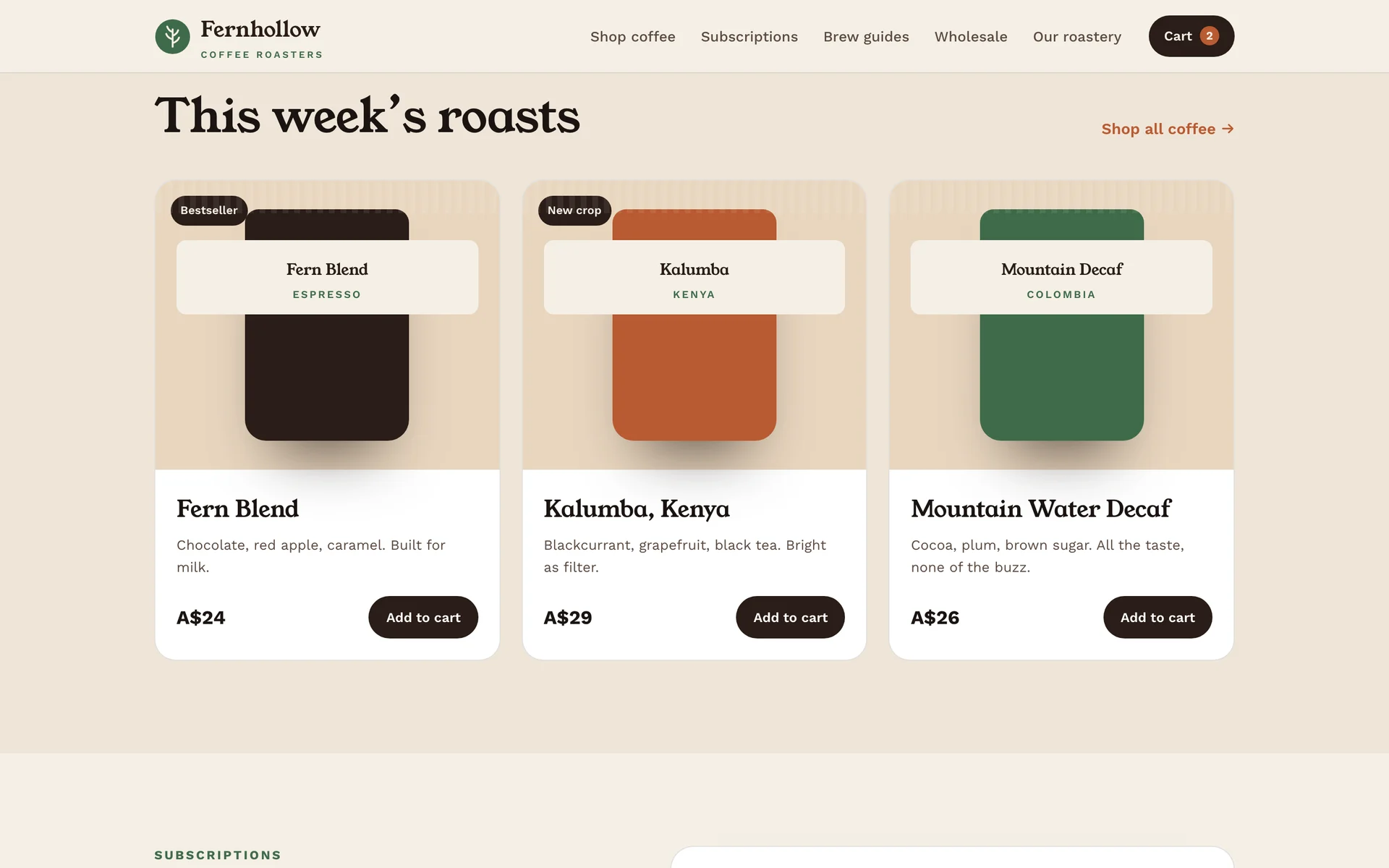
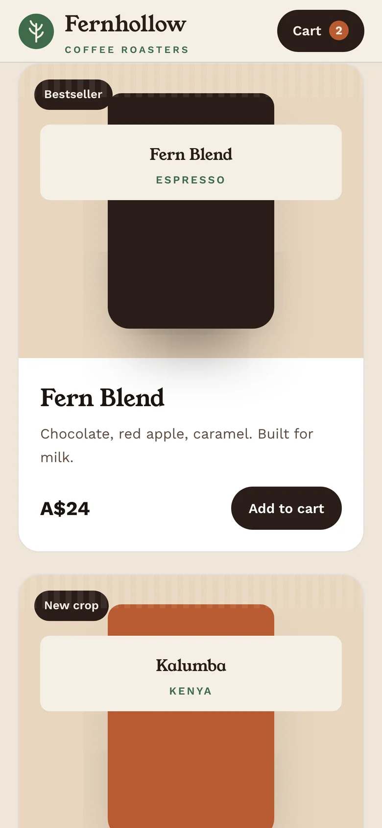
Coffee named by taste, not origin codes, with one tap to add or subscribe.
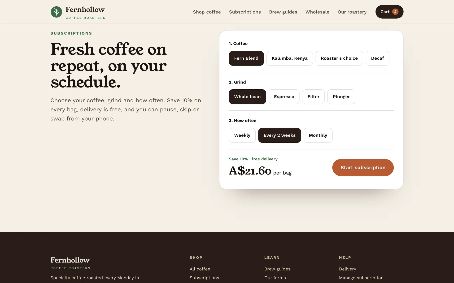
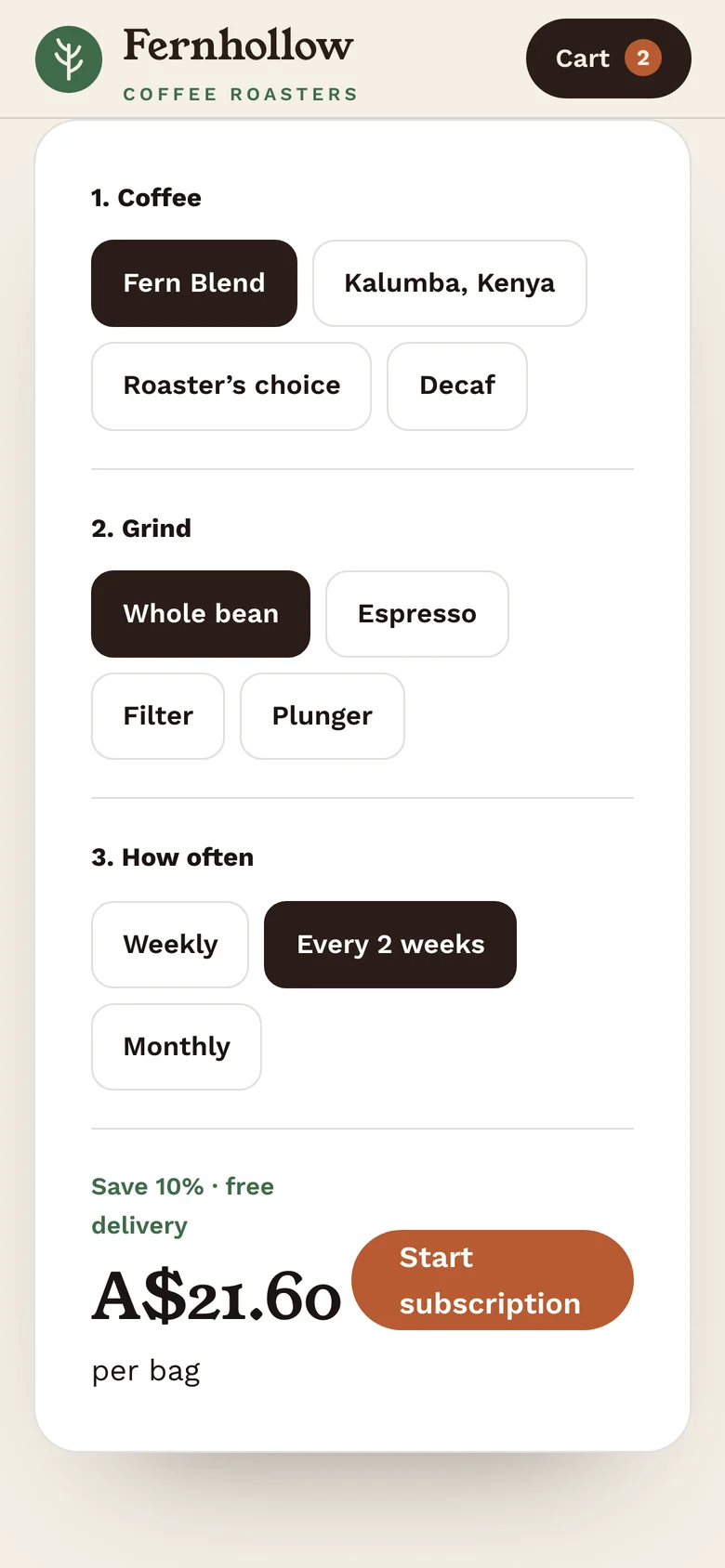
Coffee, grind and frequency in three steps, with pause, skip and swap built in.
Emails timed to when the bag runs out, with brew tips and next week’s roast.
A fern frond inside a roundel, a characterful serif and a palette taken from the roastery: espresso, crema and clay.
The roast date is the headline and the product. A live “roasted 3 days ago” note sits next to the bags.
Each coffee leads with how it tastes, then where it’s from, so a new customer can choose without knowing origins.
Coffee, grind, how often. The saving and free delivery show as the customer chooses, not at checkout.
Most reorders happen on a phone. Add to cart and the subscription builder are designed for a thumb.
A design study has no results to report. On a live project, these are the numbers in the monthly report, measured against the starting baseline.
Start with a free audit, then see exactly what we’d build and in what order.
Free audit firstNo obligationPlain-English results